For everyone2 min read
A new site for Breskens Rigging Service, and a design contest with myself
Breskens Rigging Service is getting a new site in place of WordPress. Before choosing a design, I let the same content compete in several designs.
Breskens Rigging Service, the rigging company in Breskens, had a site on WordPress (opens an external site). Today I set up its successor: a site of its own, built with Next.js (opens an external site). And before picking a single colour, I held a little contest first.
Content first, design second
The first thing I did was move the content over: the services, the partners, the contact details. Only then came the design. The content lives separately from the look, so every design uses the same text and photos. That meant I could make different designs without typing everything in again each time.
Which made a design contest possible, with me as the only entrant and the jury. I built 5 designs, each with its own idea, and could switch between them with a toggle. On the real pages, with the real text.
- Duo: the two riggers up front, as the face of the company.
- Werf (the yard): calm and solid, like a good workshop, on a grid set just off centre.
- Spec: rigging as engineering, with sizes and specifications first.
- Zeegang (sea state): photography is the boss, like a magazine.
- Direct: everything in service of getting in touch.
Why go to the trouble?
A design as a standalone picture, a mockup (opens an external site), always looks gorgeous. Until the real text has to go in. It's longer, a photo crops differently, a button doesn't fit where it should. Building every design on the real content showed me those things straight away, not after the choice was made.
And the winner is
Werf, with zeegang's editorial layout on the inner pages. Calm on the home page, and more room for photos where that fits.
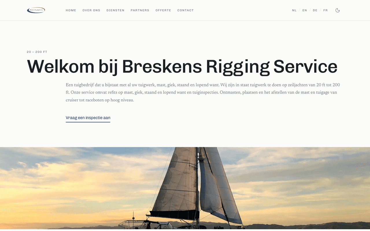
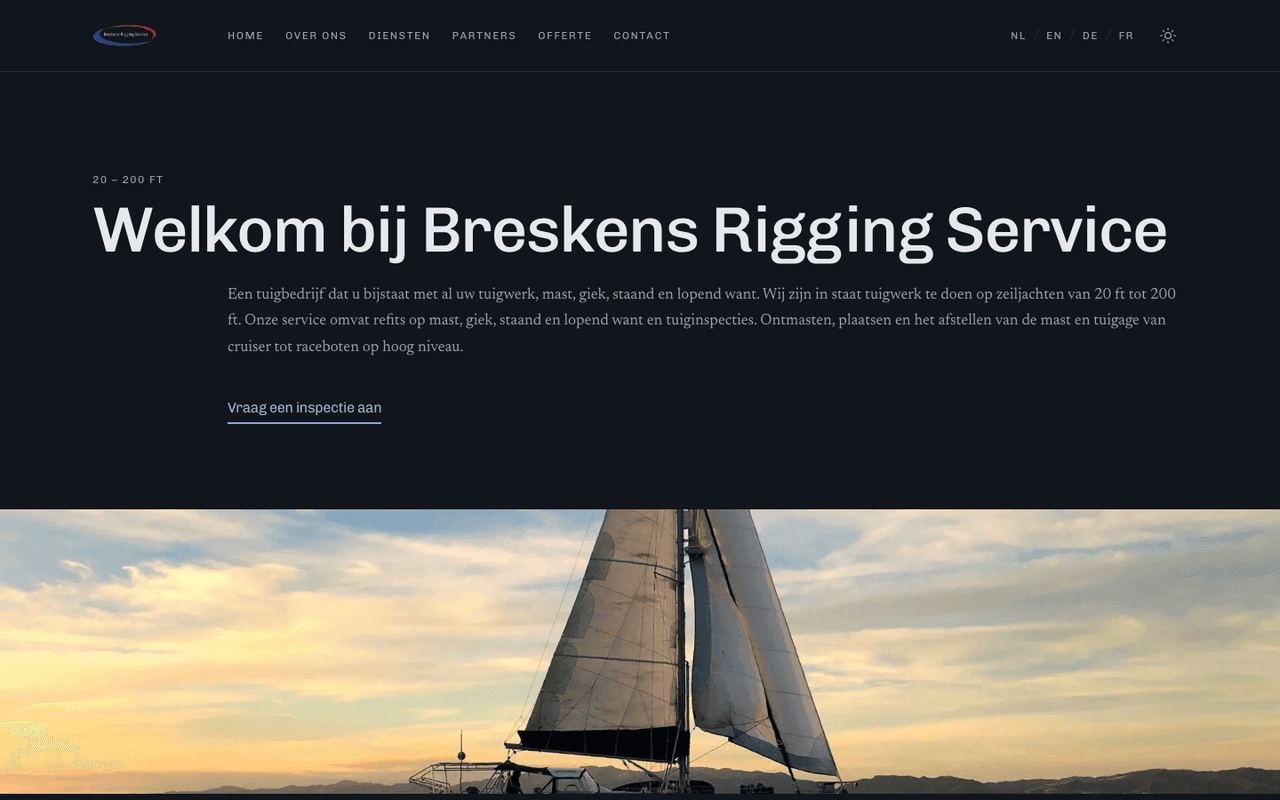
Then came the details. The colours come from the logo: navy, with red as the accent. Real photos from Breskens went in, the last partner logos, and on the contact page the faces of the riggers, Sacha and Pieter. If you call, you know straight away who you're talking to.
There's more about the site in the case study.